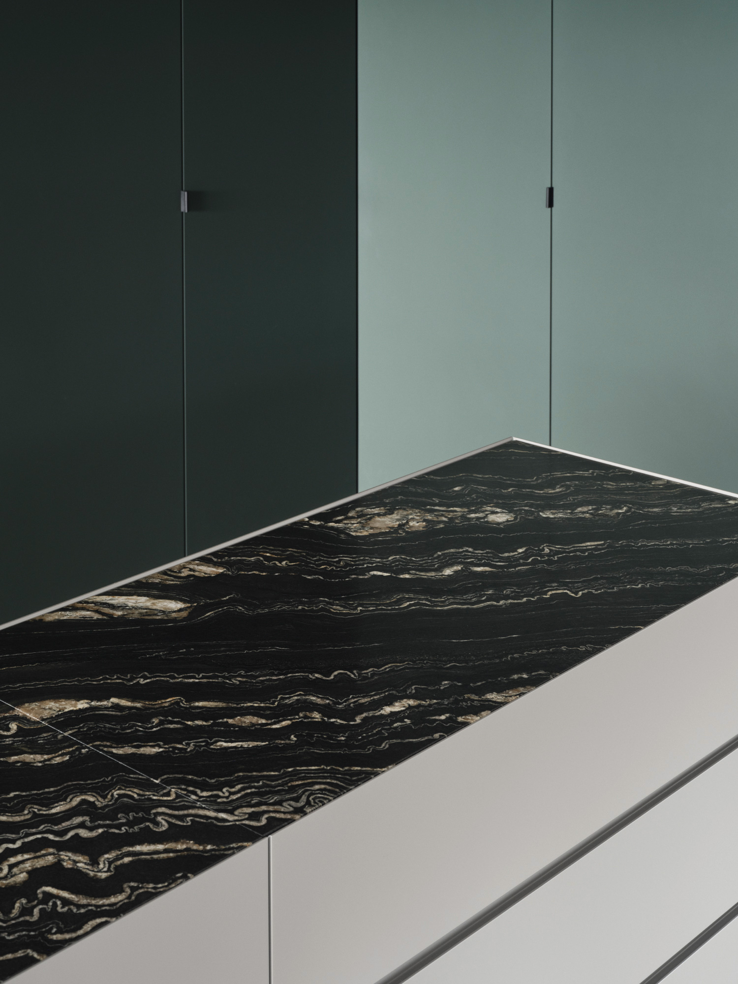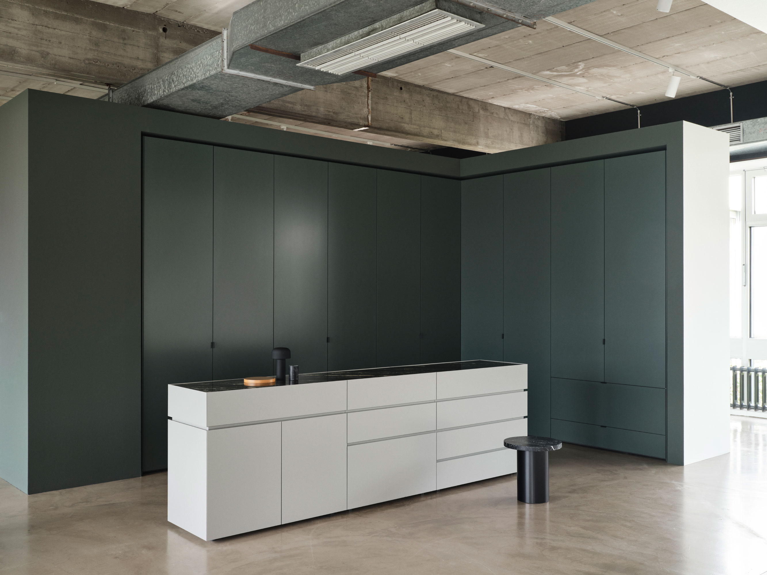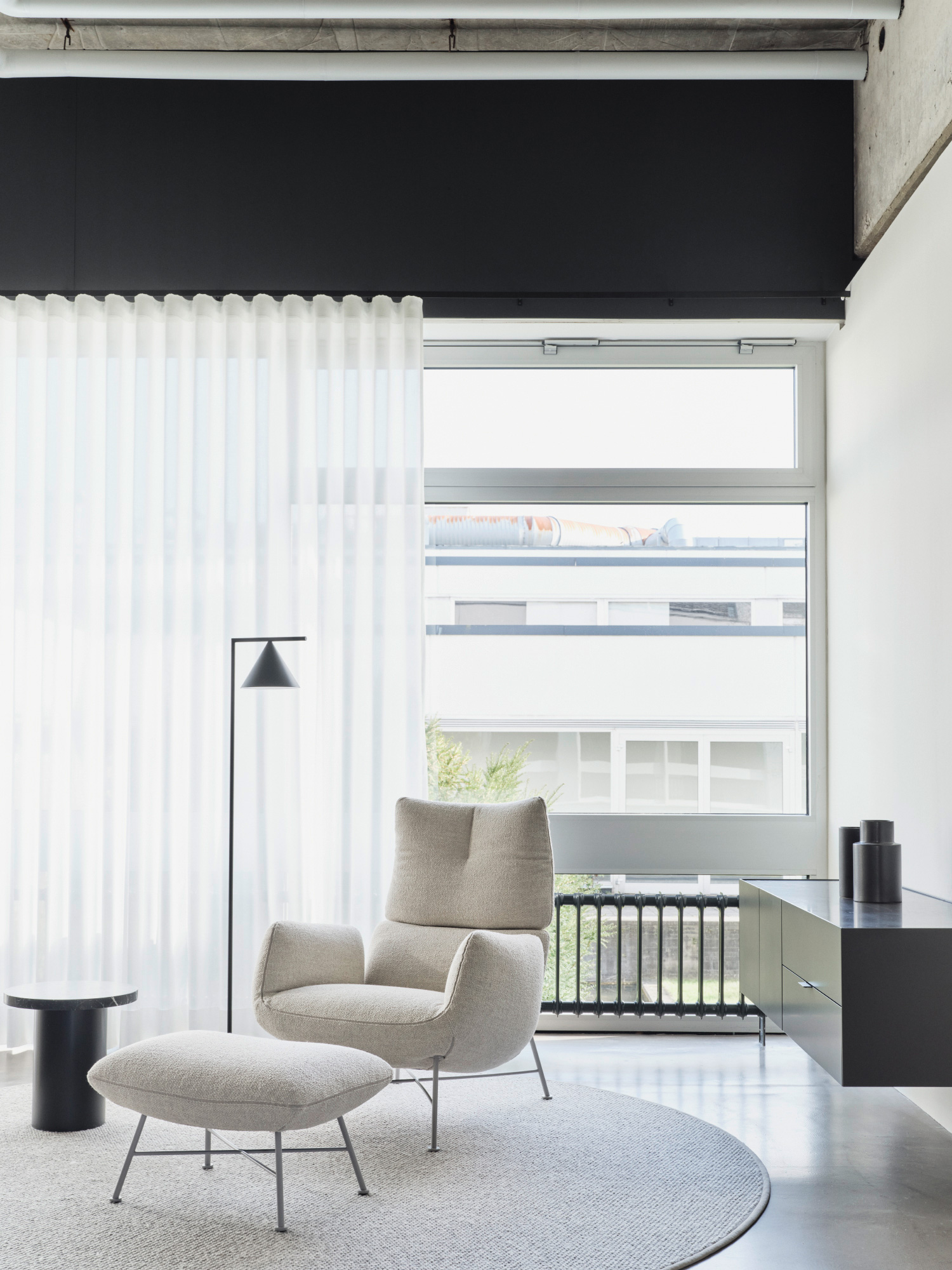
Clean lines, timeless design and local production: Interlübke, a company with a long tradition in furniture, has been synonymous with high-quality and precise craftsmanship since 1937. For the new showroom at the company’s headquarter in Rheda-Wiedenbrück, we focused on a sensitive approach to the existing iconic architecture and translated their brand values into the space.
| Client | |
|---|---|
| Year | |
| Scope | |
| Photography |

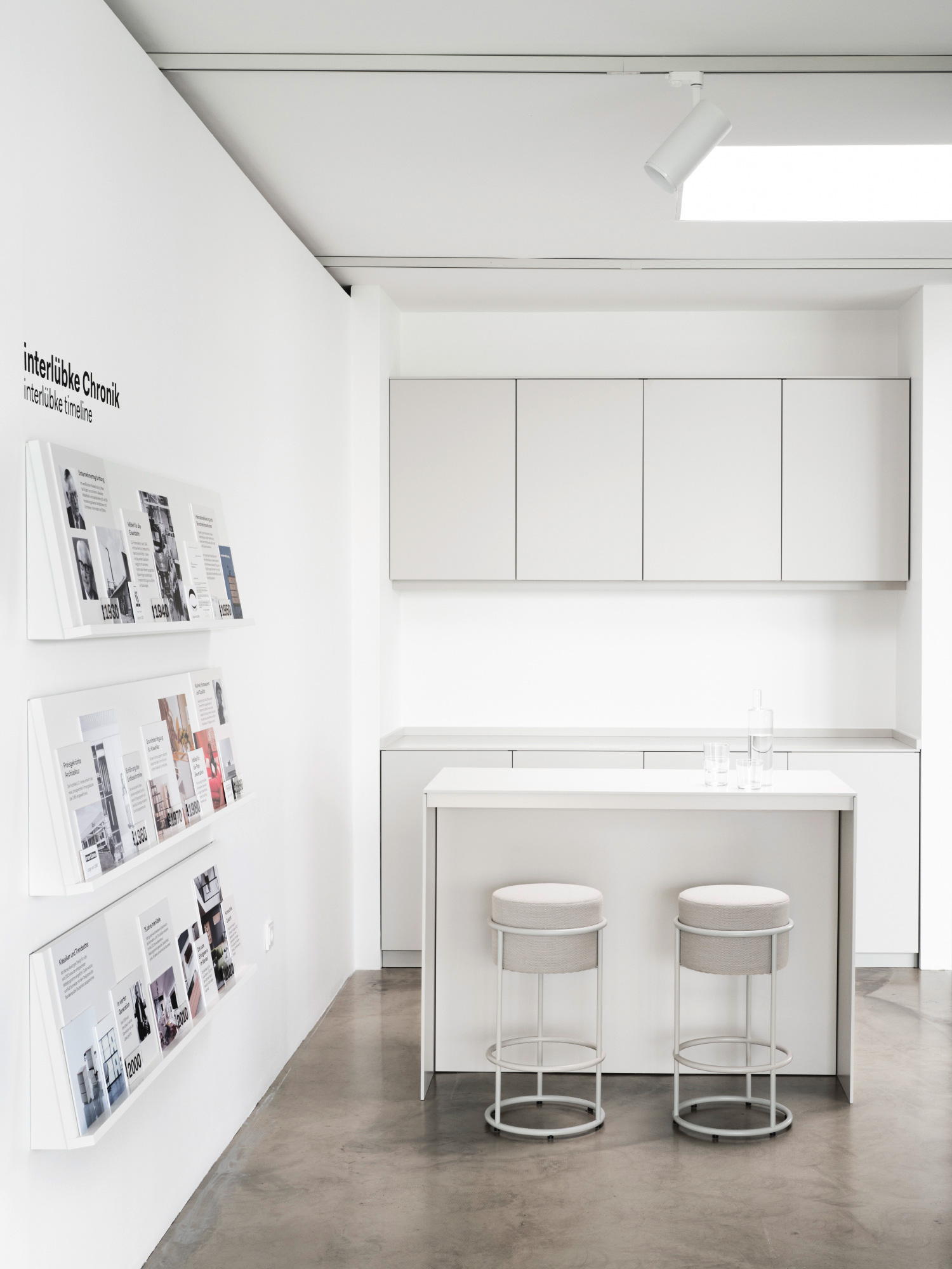
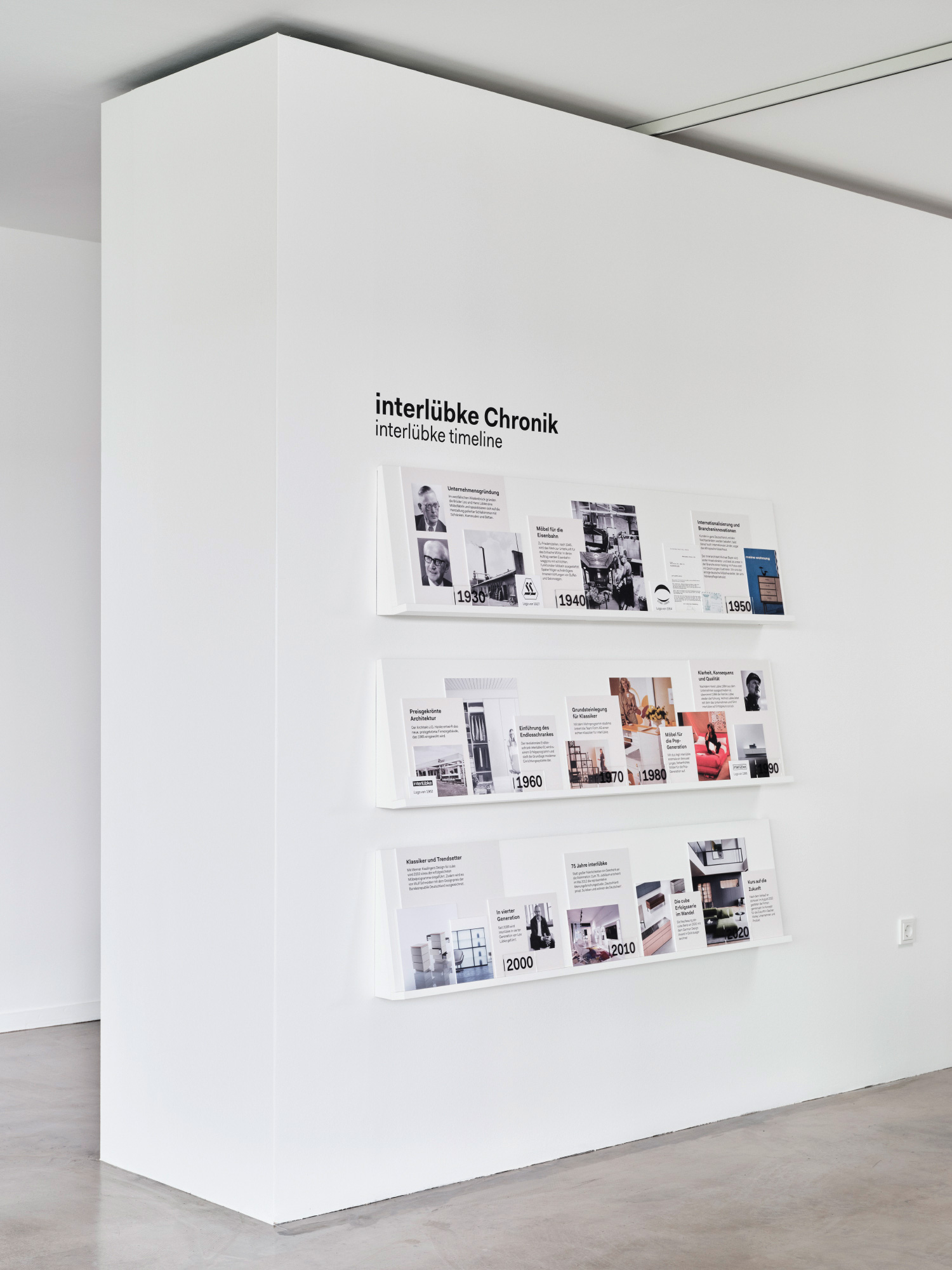
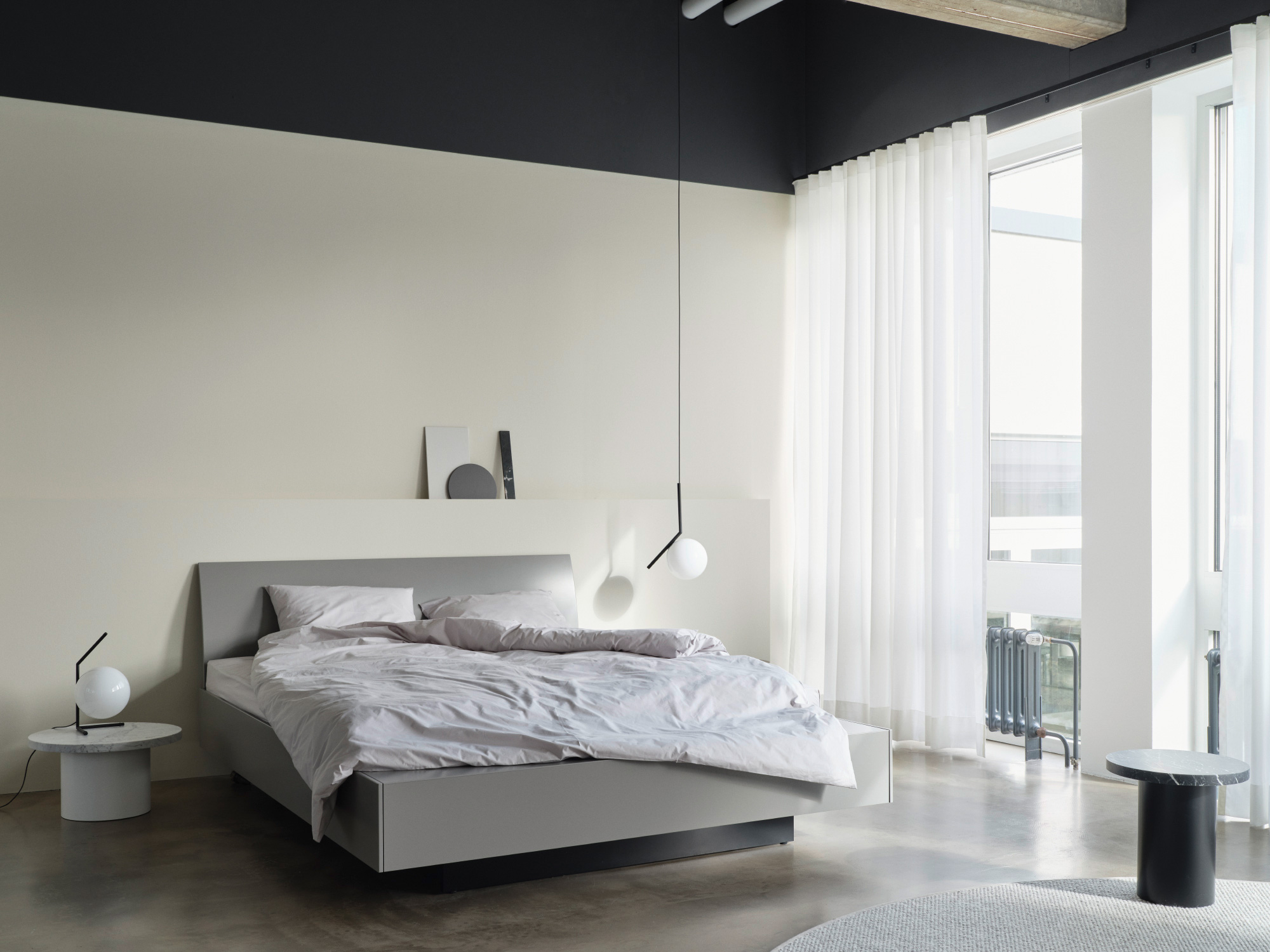
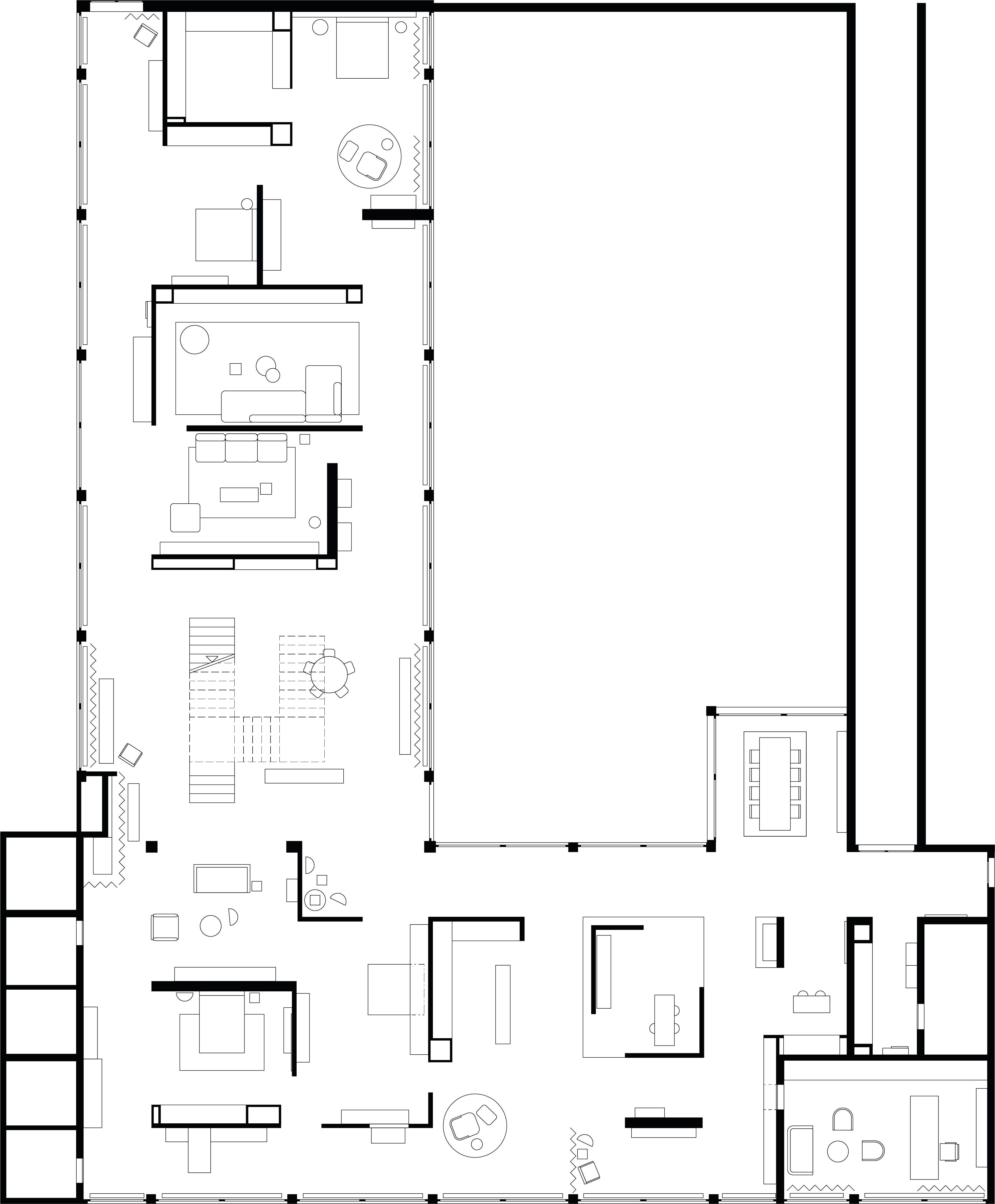
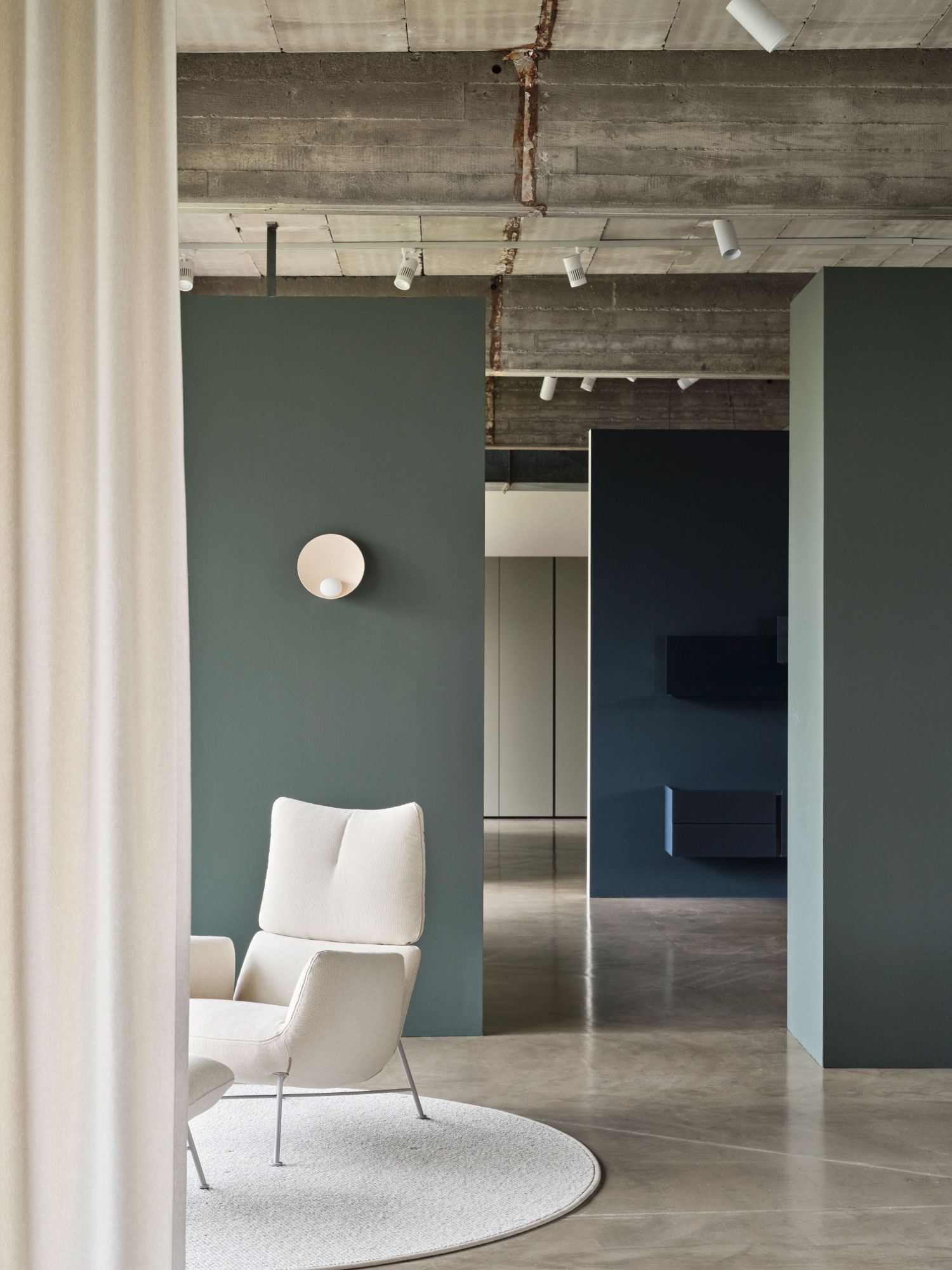
What can stay? What has to go? And what does it actually take to perceive a room as a room? An in-depth analysis of the existing 1965 architecture was the basis for the layout of the new showroom. After carefully uncovering the characteristic architectural features, free-standing wall elements now follow the strict grid of the building and form individual spaces: with as few walls as possible, but as many as necessary. Each of these milieus shows the products in a different inspiring context. With their clean lines and pure forms, the furniture fits naturally into the architectural language of the building. The showroom has a large area dedicated to the Interlübke brand. Here visitors can learn about the company's history and gain an insight into the production facilities, which are located directly behind the showroom.
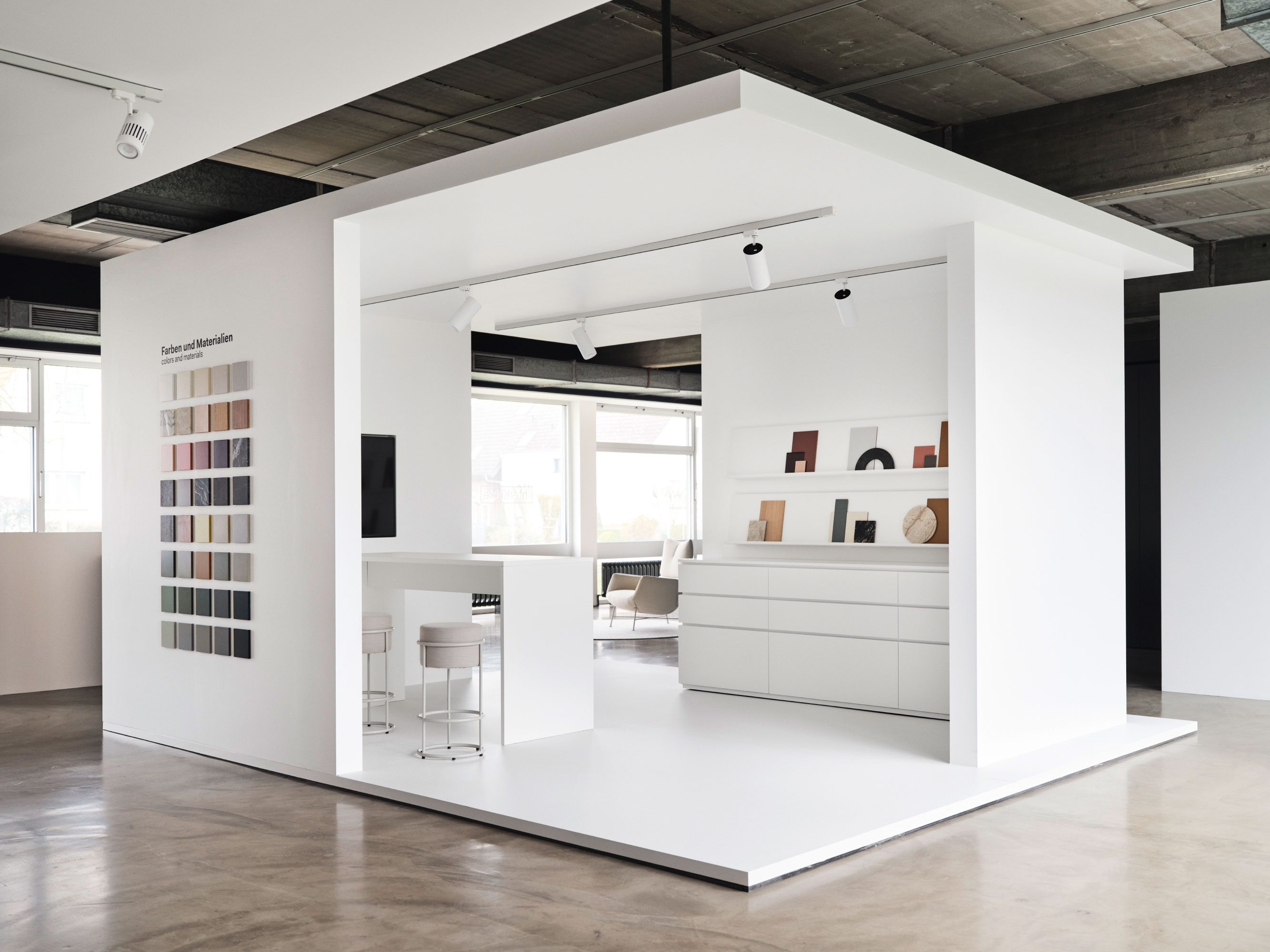
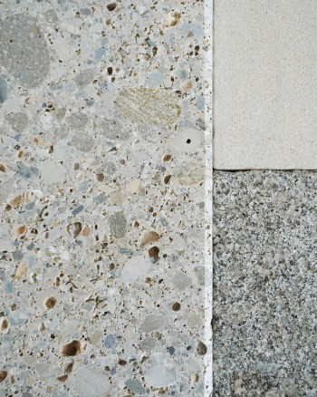
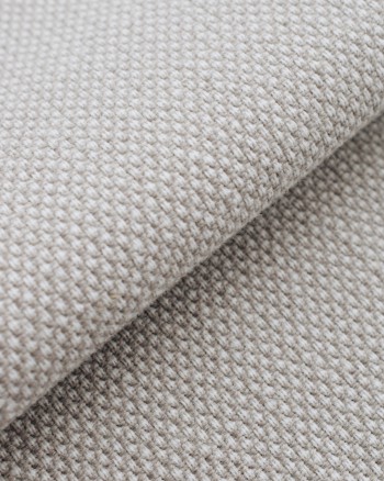
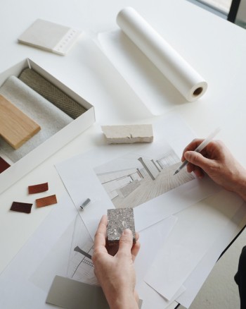
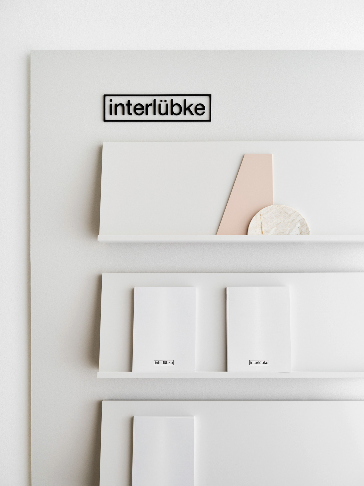
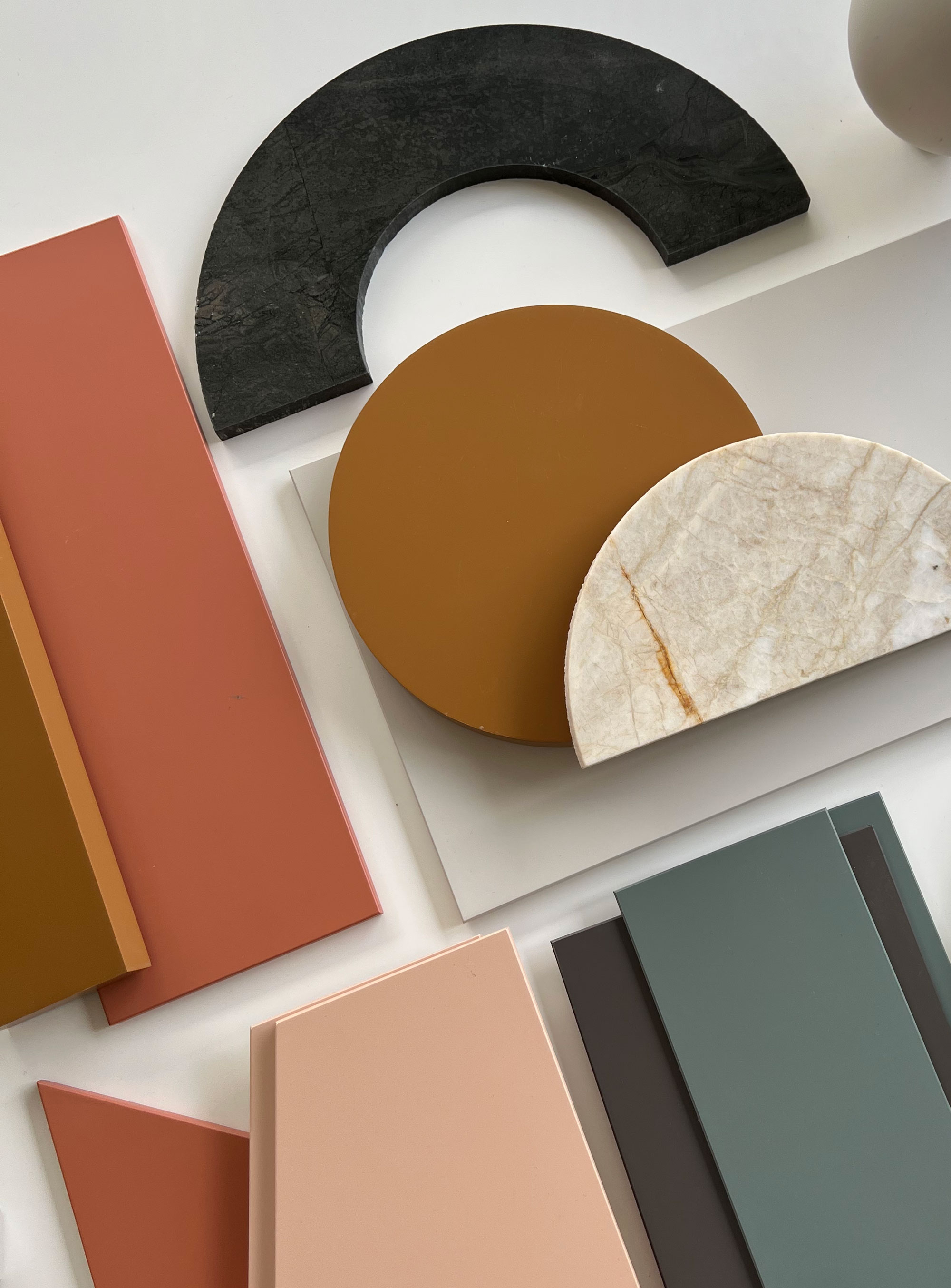
The Color Cube is a white pavilion in the centre of the room. It offers the possibility of configuring the desired furniture and viewing all the finishes in a neutral environment. All furniture is available in a wide range of selected colours, all slightly desaturated and therefore not too intense: including 24 lacquer colours, 6 different stones and 6 woods. On long wallboards, materials can be combined to create individual combinations.
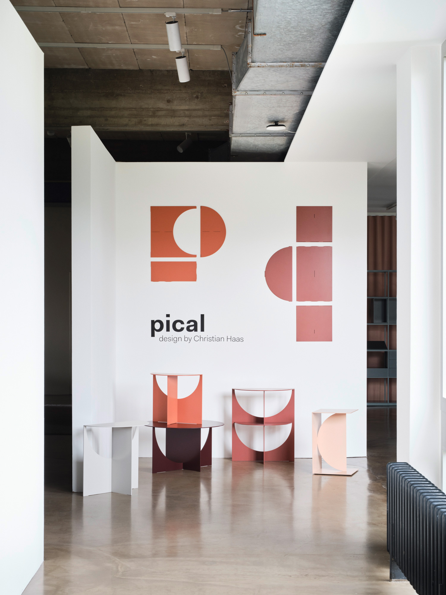
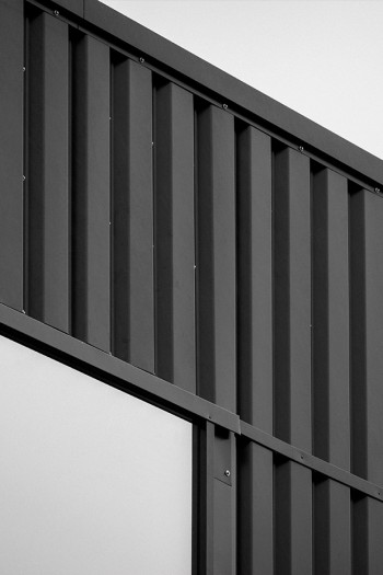
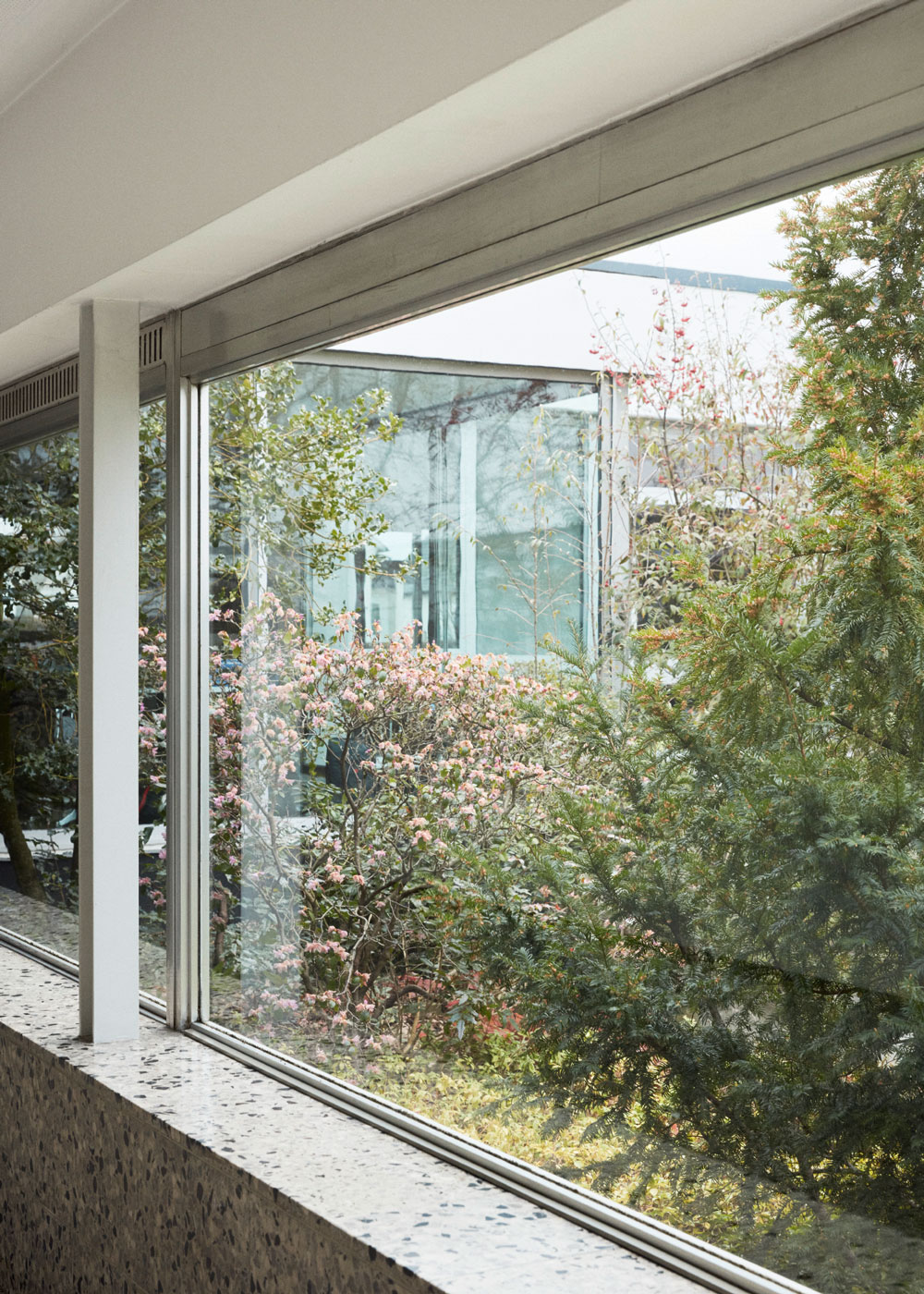
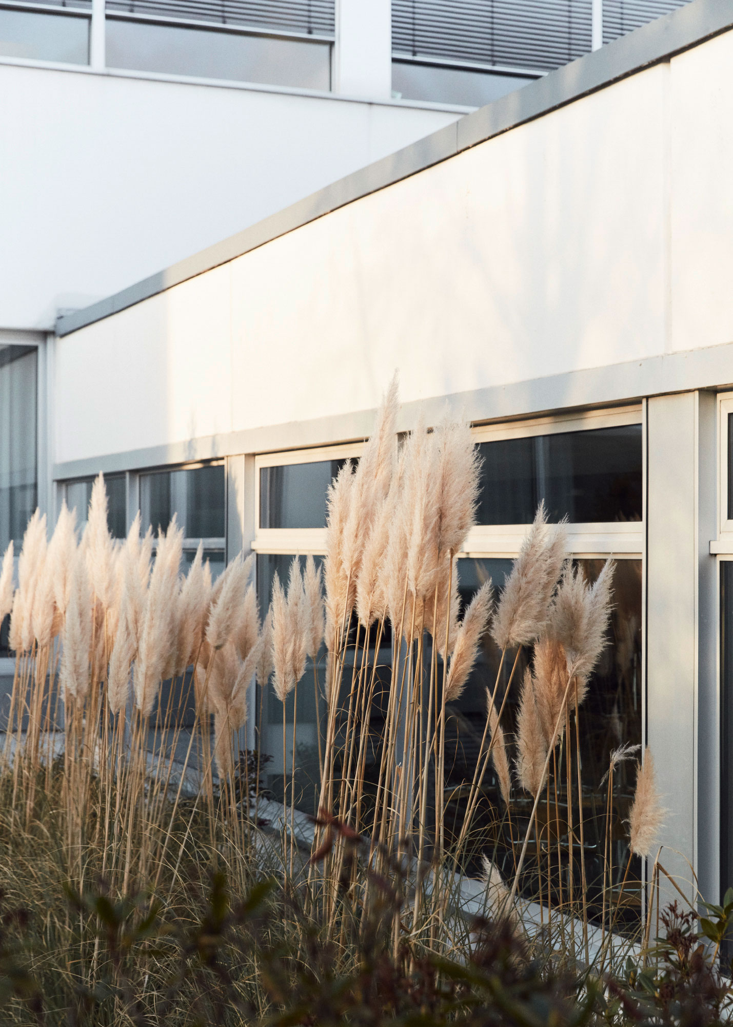
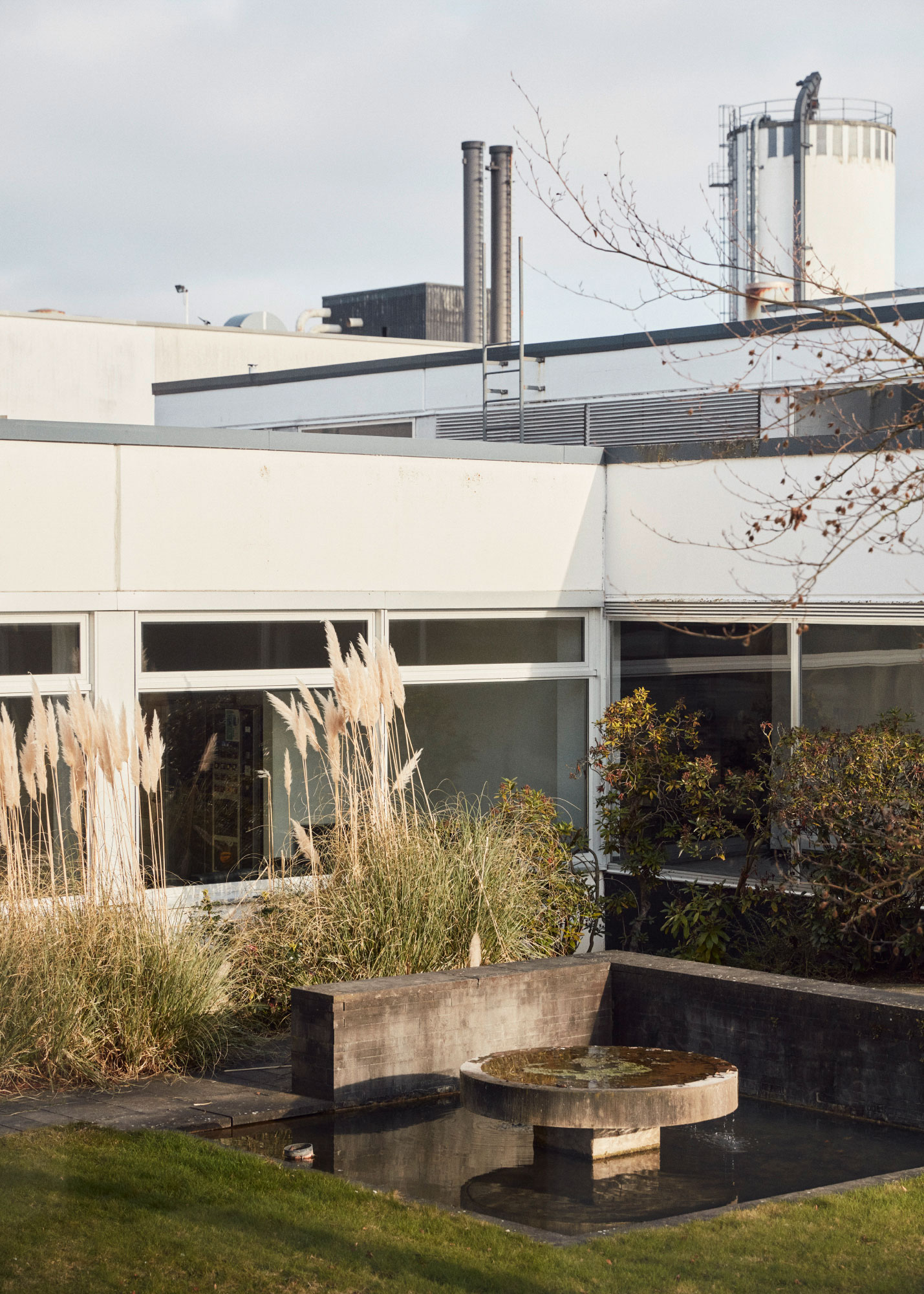
The L-shaped building by architect Joachim Georg Hanke is based on a strict grid. Even the fountain in the inner courtyard, hallways and secondary rooms follow this grid. Natural light floods the showroom from all sides. The new exhibition architecture ensures a flowing floor plan and inspiring visual axes through the space.
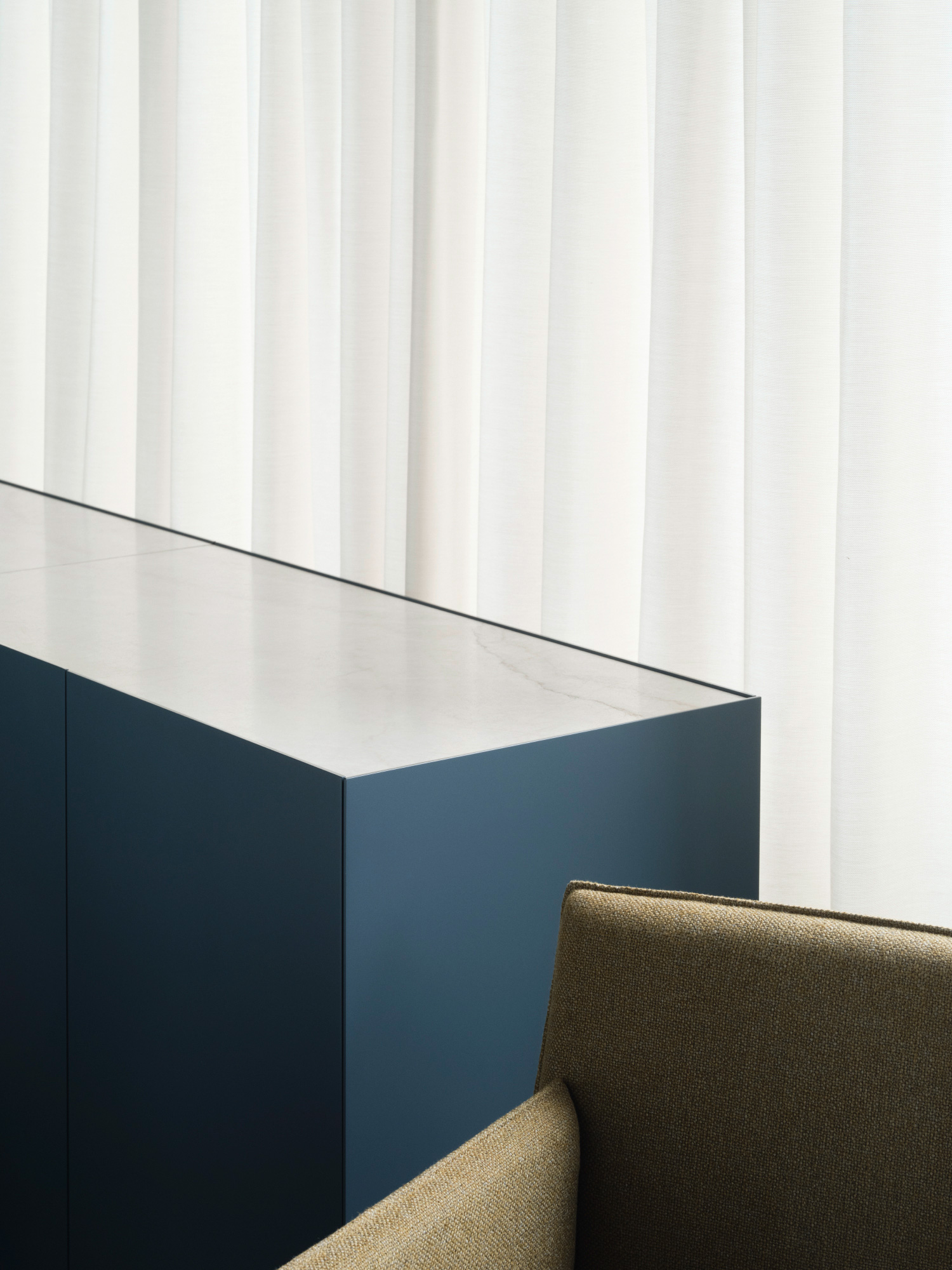
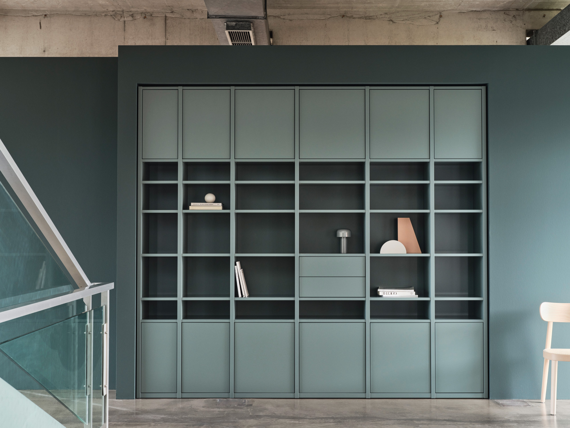

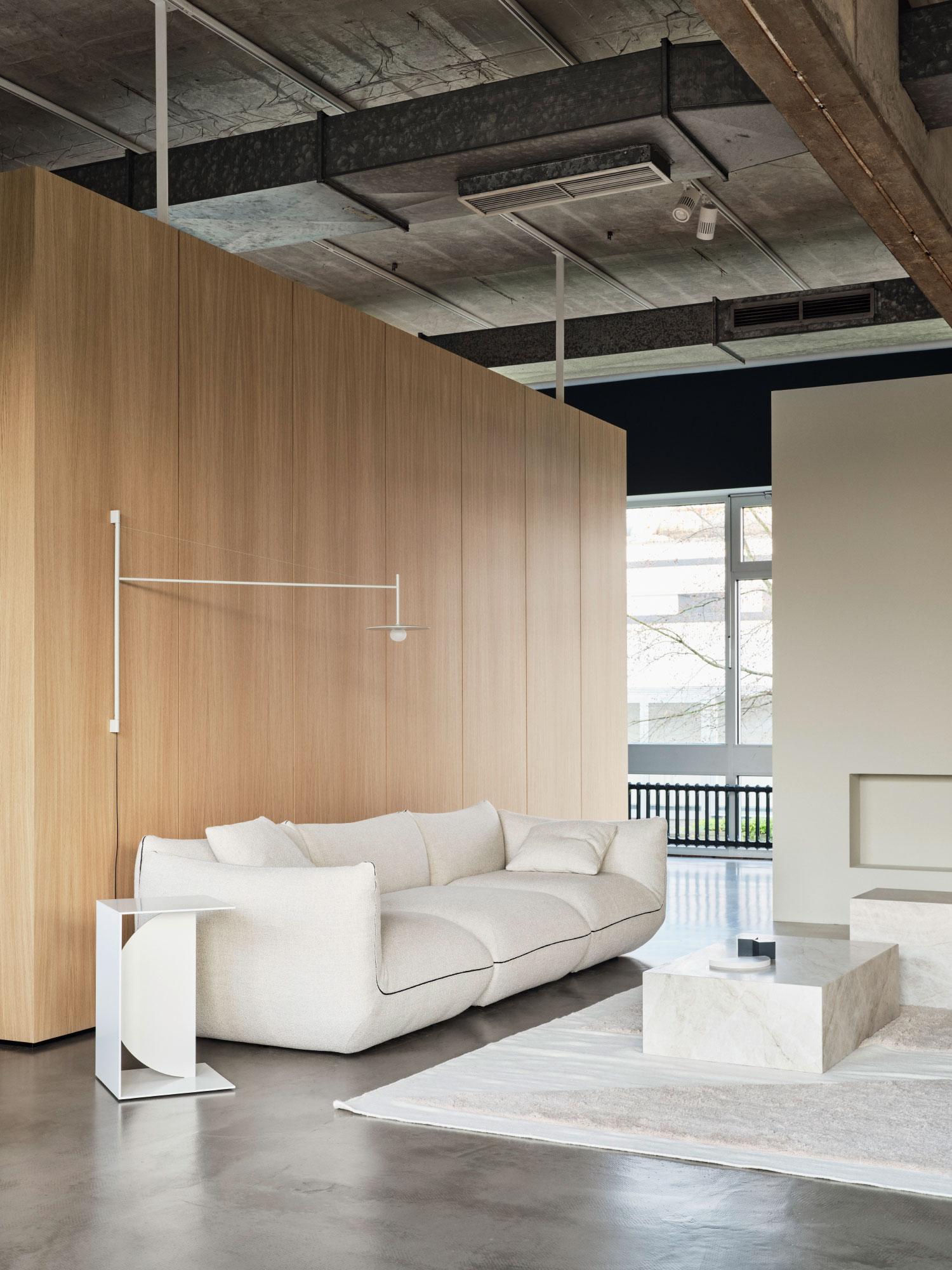
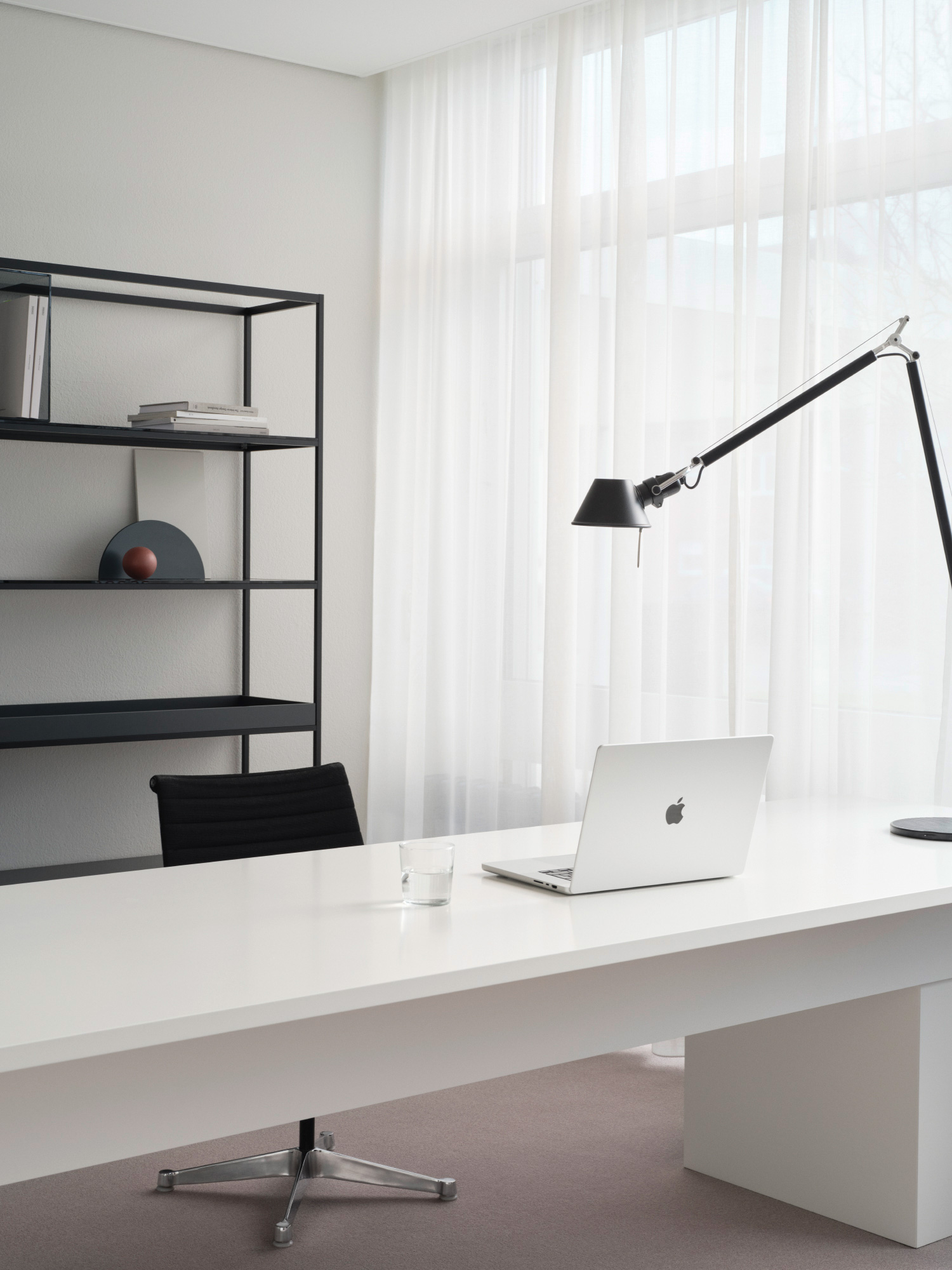
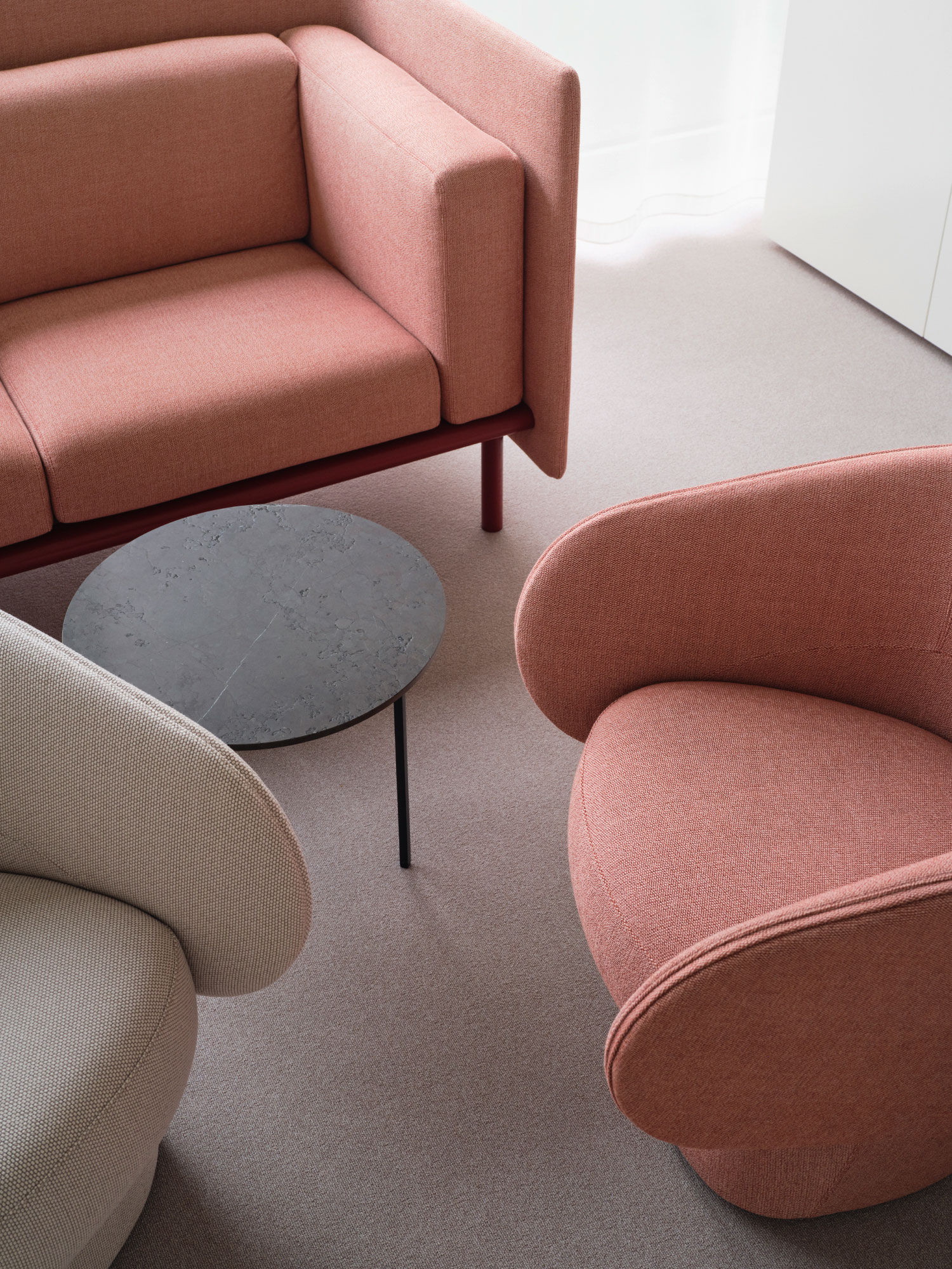
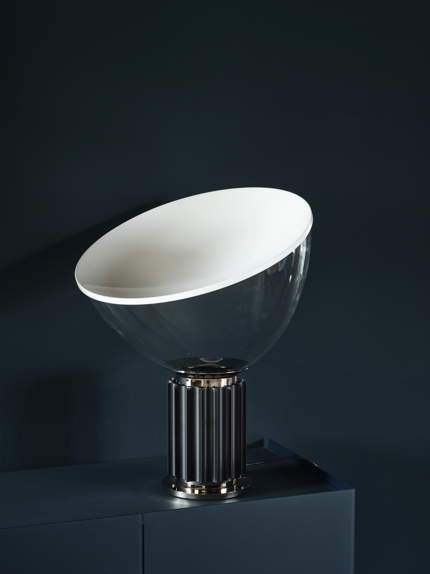
In the past, furniture was often presented as works of art: as solitaires against a backdrop. The new concept presents the products as a holistic composition, side by side with other high-quality interior brands. Inspiring home environments show the products in context - surprising and always new.
Much of the existing furniture was retained and integrated into the new design. This includes the built-in cabinet in the former directors' office, which was installed when the building was constructed. The best proof of long-lasting product quality.
